When it comes to office décor, most businesses focus on layout, lighting, and branding. But one of the most powerful and often overlooked tools in office design is colour psychology.
The colours we surround ourselves with at work have a direct impact on our mood, energy levels, focus, and even productivity. In fact, well-chosen colour schemes can support better collaboration, reduce stress, and help employees feel more motivated throughout the day.
If you’re planning an office refurbishment, designing a new workspace, or simply want to create a more engaging environment for your team, understanding colour psychology is key.
What Is Colour Psychology?
Colour psychology is the study of how colours influence human behaviour, mood, and performance. It’s long been used in marketing and branding, but its role in workplace interior design is just as important.
Different colours can stimulate different emotional and physical responses. In a work environment, this can influence everything from productivity and concentration to stress levels and creativity.
The Best Colours for Office Productivity and Focus
When designing a workspace, it’s not just about what looks good. It’s about what works. Here are some of the most effective colours to consider in your office:
Blue, The Productivity Powerhouse
Blue is known to calm the mind and help with concentration. It’s an ideal colour for high-focus areas like meeting rooms, private offices, and task-based workspaces.
Green, Balance and Wellbeing
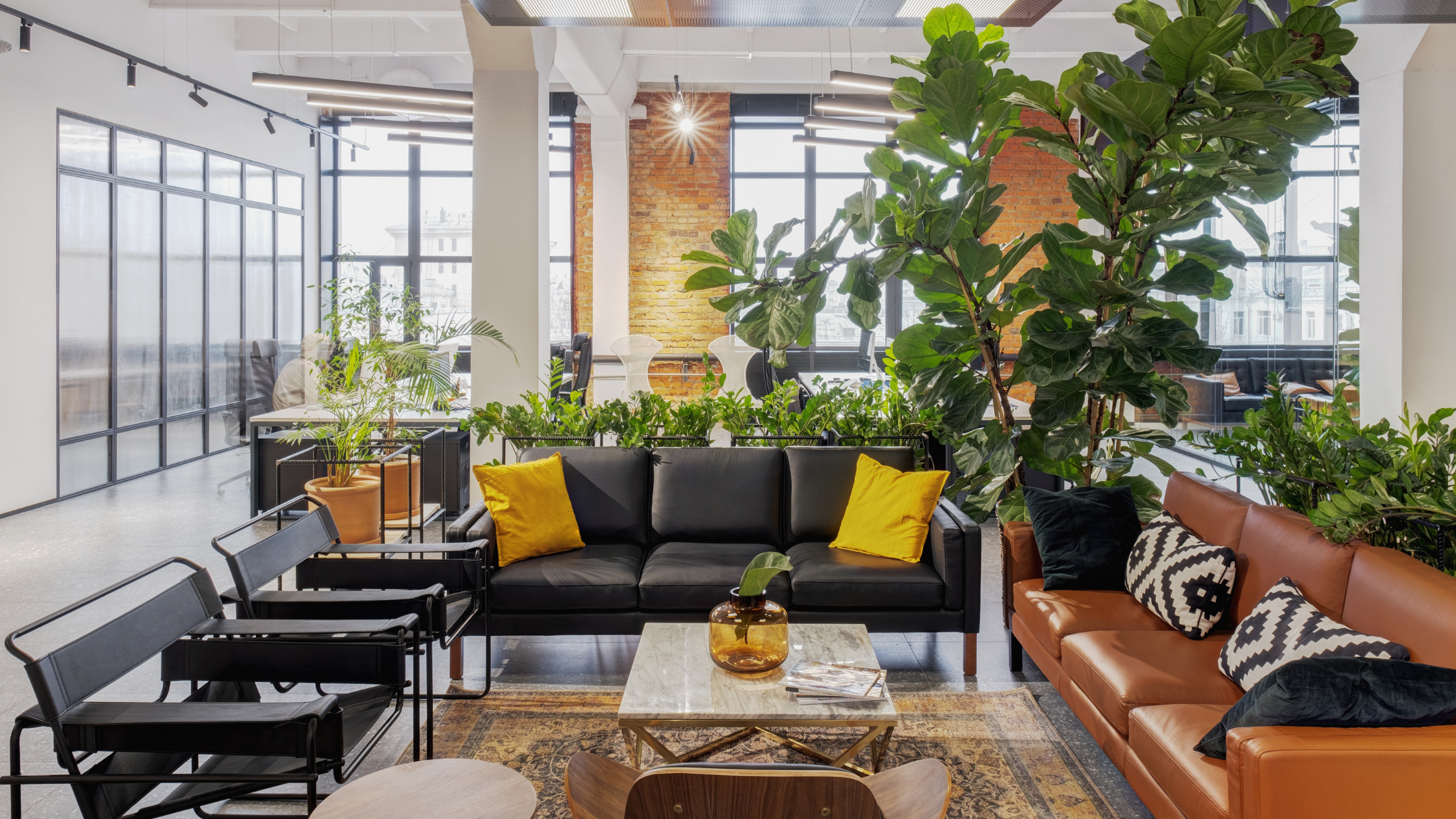
Green is associated with nature and balance. It helps reduce eye strain and creates a sense of calm, making it great for breakout areas, collaborative spaces, or anywhere employees go to recharge.
Yellow, Creativity and Optimism
Yellow stimulates creativity and can uplift mood. It’s perfect for creative studios, brainstorming rooms, and areas where you want to energise your team.
White, Clean but With Caution
White creates a feeling of cleanliness and simplicity, but too much can feel cold or sterile. It works best when balanced with warmer tones, textures, or natural materials.
Soft Pink, Calm Confidence
Often overlooked, soft pinks can bring a sense of warmth, approachability, and understated creativity. Ideal for wellness spaces or quiet zones.
Colour isn’t just about aesthetics it’s about how a space makes people feel. The right palette can energise a team, calm a busy mind, or bring a brand’s personality to life. That’s the power of thoughtful design.
- Cat Lacey, Senior Interior Designer, WOWVI Spaces
Colours to Use with Care
Some colours can have a negative effect if used too much or in the wrong way:
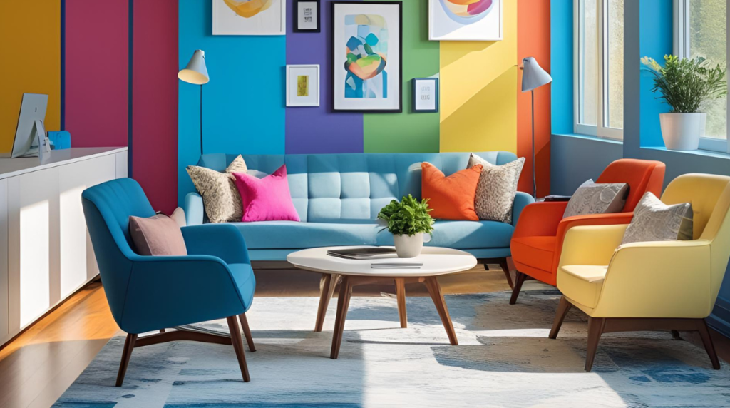
Red, High Energy, High Risk
Red grabs attention and boosts energy, but it can also increase stress and tension. Use it sparingly for accents, callouts, or in high-energy areas.
Grey & Beige, The Danger of Playing It Too Safe
While neutral tones can feel professional, too much grey or beige can make an office feel flat, dull, and uninspiring. Balance is key. Try layering with natural materials or colourful accents.
Bright White, More Glare Than Clarity
Overly white spaces may seem clean and modern but can create visual fatigue and lack warmth. Break it up with plants, artwork, or coloured furnishings.
Part of the WOWVI Group
WOWVI Spaces is proud to be part of the WOWVI Group, which means our clients benefit from a broader creative offering. Alongside our commercial interiors expertise, the group delivers high-quality TV production, commercial video, podcast creation from WOWVI Video and print solutions from Active Print, all aligned under one clear brand vision. Think WOW. Create WOW. Deliver WOW.